The Weekly is an investigative journalism docuseries covering recent topical news and cultural stories. Each episode follows a single breaking news story and the Times journalists who covered it.
This visual/sonic identity was developed in close collaboration with Joel Pickard and the teams at The New York Times and the production company Left/Right for FX and hulu.
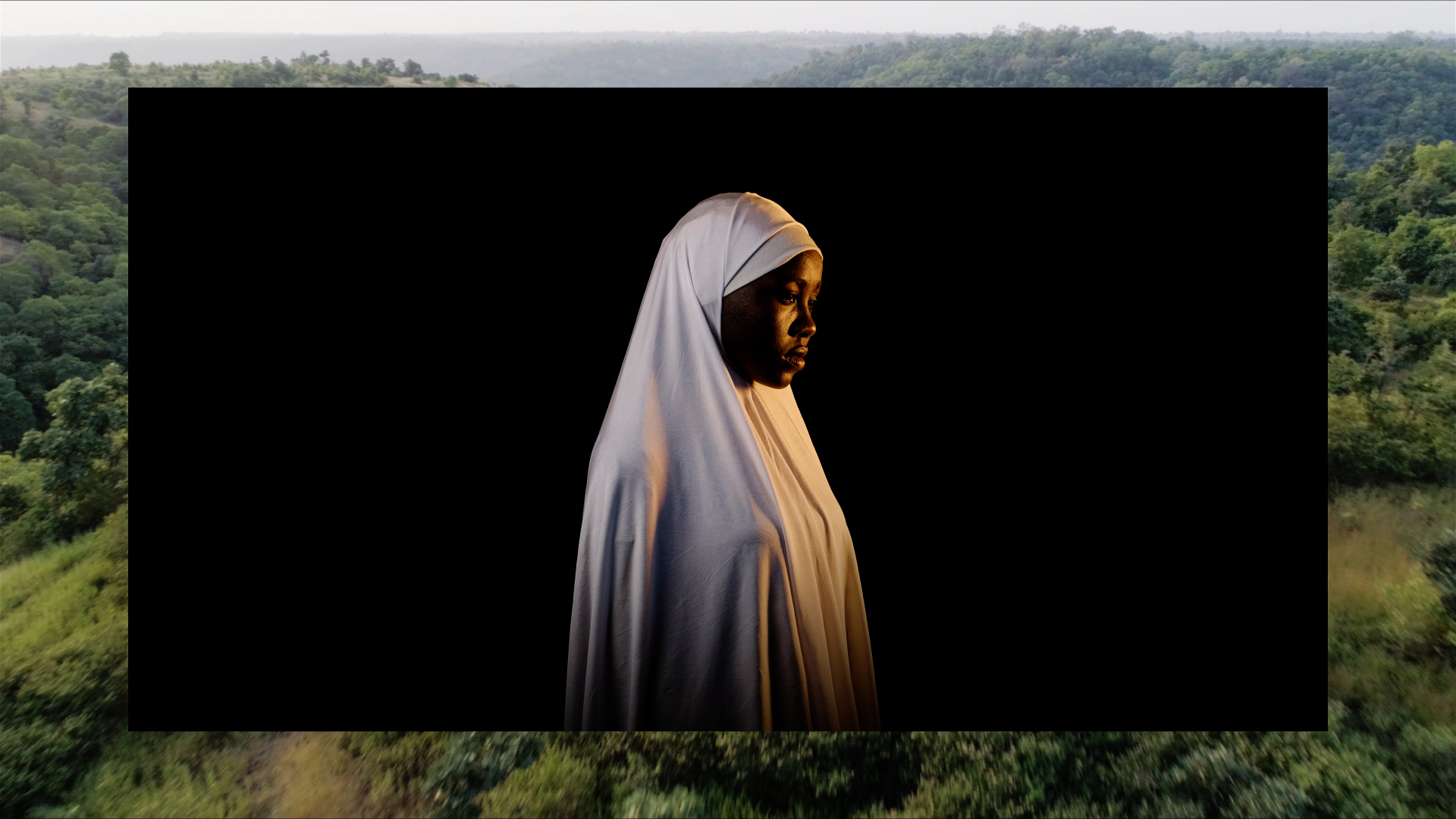
A minimal framing device is used both to focus attention and to combine disparate elements, allowing stories to shift and evolve over time.
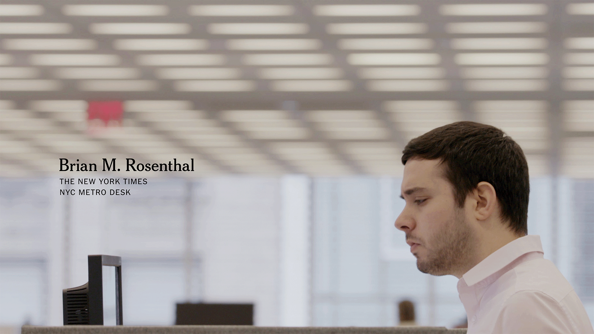
The typographic framework was built upon established Times styles, modified and expanded for broadcast purposes. It serves as a graphic throughline, supporting storylines in a clean, consistent manner.
Client:The New York Times & Left/Right Kelly Doe, Director, Brand Identity, NYT Ken Druckerman, Co-Founder, Left/Right
The system was expanded for promotional purposes:
Twitter Instagram Masthead Icon Color Palettes Billboards Video Projection Loop Custom Logos
FX, with the firm Ultrabland, are creating the ongoing promotional trailers, adverts, and social media assets. These samples show how they’ve interpreted the identity system for those uses. Music by Joel Pickard.